AppInventor
Basic Components
VER MAIS DETALHADO EM https://joners-inventor.appspot.com/learn/reference/components/animation.html
Button
Buttons are components that users touch to perform some action in your app.
Buttons detect when users tap them. Many aspects of a button's appearance can be changed. You can use the Enabled property to choose whether a button can be tapped.
Properties
- BackgroundColor
- Color for button background.
- Enabled
- If set, user can tap button to cause action.
- FontBold
- If set, button text is displayed in bold.
- FontItalic
- If set, button text is displayed in italics.
- FontSize
- Point size for button text.
- FontTypeface
- Font family for button text.
- Height
- Button height (y-size).
- Width
- Button width (x-size).
- Image
- Image to display on button.
- Text
- Text to display on button.
- TextAlignment
- Left, center, or right.
- TextColor
- Color for button text.
Events
- Click()
- User tapped and released the button.
- GotFocus()
- Button became the focused component.
- LostFocus()
- Button stopped being the focused component.
Canvas
A two-dimensional touch-sensitive rectangular panel on which drawing can be done and sprites can be moved.
The BackgroundColor , PaintColor , BackgroundImage , Width , and Height of the Canvas can be set in either the Designer or in the Blocks Editor. The Width and Height are measured in pixels and must be positive.
Any location on the Canvas can be specified as a pair of (X, Y) values, where
- X is the number of pixels away from the left edge of the Canvas
- Y is the number of pixels away from the top edge of the Canvas
There are events to tell when and where a Canvas has been touched or a Sprite ( ImageSprite or Ball ) has been dragged. There are also methods for drawing points, lines, and circles.
Properties
- BackgroundColor
- The color of the canvas background.
- BackgroundImage
- The name of a file containing the background image for the canvas
- Height
- LineWidth
- The width of lines drawn on the canvas.
- PaintColor
- The color in which lines are drawn
- Visible
- Whether the component is visible
- Width
Events
- Dragged(number startX, number startY, number prevX, number prevY, number currentX, number currentY, boolean draggedSprite)
- When the user does a drag from one point (prevX, prevY) to another (x, y). The pair (startX, startY) indicates where the user first touched the screen, and "draggedSprite" indicates whether a sprite is being dragged.
- Touched(number x, number y, boolean touchedSprite)
- When the user touches a canvas, providing the (x, y) position of the touch relative to the upper left corner of the canvas. The value "touchedSprite" is true if a sprite was also in this position.
Methods
- Clear()
- Clears the canvas, without removing the background image, if one was provided.
- DrawCircle(number x, number y, number r)
- Draws a circle (filled in) at the given coordinates on the canvas, with the given radius.
- DrawLine(number x1, number y1, number x2, number y2)
- Draws a line between the given coordinates on the canvas.
- DrawPoint(number x, number y)
- Draws a point at the given coordinates on the canvas.
- Save()
- Saves a picture of this Canvas to the device's external storage and returns the full path name of the saved file. If an error occurs the Screen's ErrorOccurred event will be called.
- SaveAs(text filename)
- Saves a picture of this Canvas to the device's external storage in the file named fileName. fileName must end with one of ".jpg", ".jpeg", or ".png" (which determines the file type: JPEG, or PNG). Returns the full path name of the saved file.
CheckBox
Check box components can detect user taps and can change their boolean state in response.
A check box component raises an event when the user taps it. There are many properties affecting its appearance that can be set in the Designer or Blocks Editor.
Properties
- BackgroundColor
- Color for check box background.
- Checked
- True if the box is checked, false otherwise.
- Enabled
- If set, user can tap check box to cause action.
- Height
- Check box height (y-size).
- Width
- Check box width (x-size).
- Text
- Text to display on check box.
- TextColor
- Color for check box text.
- Visible
- If set, check box is visible.
Events
- Click()
- User tapped and released check box.
- GotFocus()
- Check box became the focused component.
- LostFocus()
- Check box stopped being the focused component.
Clock
Use a clock component to create a timer that signals events at regular intervals. The clock component also does various conversions and manipulations with time units.
One use of the clock component is a a timer : set the timer interval, and the timer will fire repeatedly at the interval, signalling a timer event.
A second use of the clock component is to manipulate time, and express time in various units. The internal time format used by the clock is called an instant . The clock's Now method returns the current time as an instant. The clock provides methods to manipulate instants, for example, return an instant that is several seconds, or months, or years from the given instant. It also provides methods to show the second, minute, hour, day, …, corresponding to a given instant.
Properties
- TimerInterval
- timer interval in milliseconds
- TimerEnabled
- If true, then the timer will fire
- TimerAlwaysFires
- if true, the timer will fire even if the application is not showing on the screen
Events
- Timer()
- This event is signaled when the timer fires
Methods
- SystemTime()
- The phone's internal time in milliseconds
- Now()
- The instant in time read from phone's clock
- MakeInstant(Text from)
- Make an instant specified by MM/DD/YYYY hh:mm:ss or MM/DD/YYYY or hh:mm.
- MakeInstantFromMillis(Number millis)
- Make an instant specified by time in milliseconds
- GetMillis(instant)
- The instant in time measured as milliseconds since 1970
- AddSeconds(instant, Number seconds)
- An instant in time some number of seconds after the given instant
- AddMinutes(instant, Number minutes)
- An instant in time some number of minutes after the given instant
- AddHours(instant, Number hours)
- An instant in time some number of hours after the given instant
- AddDays(instant, Number days)
- An instant in time some number of days after the given instant
- AddWeeks(instant, Number weeks)
- An instant in time some number of weeks after the given instant
- AddMonths(instant, Number months)
- An instant in time some number of months after the given instant
- AddYears(instant, Number years)
- An instant in time some number of years after the given instant
- Duration(Calendar start, Calendar end)
- Milliseconds between instants
- Second(Calendar instant)
- The second of the minute
- Minute(Calendar instant)
- The minute of the hour
- Hour(Calendar instant)
- The hour of the day
- DayOfMonth(Calendar instant)
- The day of the month,a number from 1 to 31
- Weekday(Calendar instant)
- The day of the week. a number from 1 (Sunday) to 7 (Saturday)
- WeekdayName(Calendar instant)
- The name of the day of the week
- Month(Calendar instant)
- The month of the year, a number from 1 to 12)
- MonthName(Calendar instant)
- The name of the month
- Year(Calendar instant)
- The year
- FormatDateTime(Calendar instant)
- Text describing the date and time of an instant
- FormatDate(Calendar instant)
- Text describing the date of an instant
- FormatTime(Calendar instant)
- Text describing time time of an instant
Image

You use image components to represent images that users select and manipulate.
An image component displays an image. You can specify the picture to display and other aspects of the image's appearance in the Designer or in the Blocks Editor.
Properties
- Picture
- Picture displayed by this image.
- Visible
- If true, image is displayed.
- Height
- Image height (y-size).
- Width
- Image width (x-size).
<html lang="en"><head><meta charset="utf-8"><meta content="App Inventor for Android" name="description"><meta content="Android, Blocks App Inventor, Mobile, Phone, IDE" name="keywords"><title> Animation Components - App Inventor for Android </title><link href="/static/images/appinventor-16.png" rel="SHORTCUT ICON" type="image/ico"><link href="/static/images/appinventor-16.png" rel="icon" type="image/png"><link href="/static/css/appinventor.css" rel="stylesheet"><script src="http://www.google.com/js/gweb/analytics/autotrack.js"></script><script> var tracker = new gweb.analytics.AutoTrack({ profile: 'UA-5856106-2' }); </script><style> img.c2 {border-width:0} div.c1 {clear:both;}
</style></head><body>
Learn about App Inventor
Animation Components
- <a href="#Ball">Ball</a>
- <a href="#ImageSprite">ImageSprite</a>
Ball
<img alt="" src="images/ball.png">
A ball component is a particular kind of sprite (animated object) that looks like a ball.
A ball is a round sprite that is contained by a canvas, can react to touches and
drags, interact with other sprites (image sprites and other balls) and the edge of
the canvas, and move according to its properties. For example, to have a ball move
4 pixels toward the top of a canvas every 500 milliseconds (half second), you can
set the Speed</syntaxhighlight> property to 4, the Interval</syntaxhighlight> property to
500, the Heading</syntaxhighlight> property to 90 (degrees), and the
Enabled</syntaxhighlight> property to True. You can change these and other properties to
modify the ball's behavior.
The difference between a ball and an image sprite is that the latter can get its
appearance from an image, while a ball's appearance can only be changed by varying
its PaintColor</syntaxhighlight> and Radius</syntaxhighlight> properties.
Properties
Radius</syntaxhighlight>
Radius of the ball.
PaintColor</syntaxhighlight>
Color used for drawing the ball.
Enabled</syntaxhighlight>
If true, ball is active.
Interval</syntaxhighlight>
Frequency of ball's movement in milliseconds.
Visible</syntaxhighlight>
If set, ball is visible.
Heading</syntaxhighlight>
Direction of the ball's travel.
X</syntaxhighlight>
Ball's x-coordinate.
Y</syntaxhighlight>
Ball's y-coordinate.
Speed</syntaxhighlight>
Number of pixels ball moves each period.
Events
CollidedWith(component other)</syntaxhighlight>
Called when two animated components (image sprites or balls) have collided. The
argument other</syntaxhighlight> represents the other component in the collision.
Dragged(number startX, number startY, number prevX, number prevY, number
currentX, number currentY)</syntaxhighlight>
The ball was dragged. See the canvas Dragged</syntaxhighlight> event for a description
of the arguments.
EdgeReached(number edge)</syntaxhighlight>
Called when ball reaches the edge of the screen. The edge</syntaxhighlight> argument
tells which edge (or corner) was reached, encoded as follows:
- north = 1
- northeast = 2
- east = 3
- southeast = 4
- south = -1
- southwest = -2
- west = -3
- northwest = -4
Note that opposite directions are negations of each other.
NoLongerCollidingWith(component other)</syntaxhighlight>
Called when two animated components have stopped colliding.
Touched(number x, number y)</syntaxhighlight>
Called when user touches the ball.
Methods
Bounce(number edge)</syntaxhighlight>
Makes the ball bounce, as if off a wall (or corner). The meaning of the argument
is the same as in EdgeReached</syntaxhighlight>. You can set up the
EdgeReached</syntaxhighlight> event to make the ball bounce off whichever edge was
reached, causing the ball to appear to bounce elastically from all edges and
corners.
boolean CollidingWith(component other)</syntaxhighlight>
Reports whether this ball is colliding with the given component.
MoveIntoBounds()</syntaxhighlight>
If the ball is out of bounds, this method moves it back in bounds.
MoveTo(number x,number y)</syntaxhighlight>
Moves the ball directly to the given point.
ImageSprite
<img alt="" src="images/imagesprite.png">
An image sprite component is an animated object that can interact with a canvas,
balls, and other image sprites.
An image sprite is an animated object that is contained by a canvas, can react to
touches and drags, interact with other sprites (image sprites and other balls) and
the edge of the canvas, and move according to its properties. For example, to have
a sprite move 10 pixels to the left every second, you can set the
Speed</syntaxhighlight> property to 10, the Interval</syntaxhighlight> property to 1000
(milliseconds), the Heading</syntaxhighlight> property to 180 (degrees), and the
Enabled</syntaxhighlight> property to True. You can change these and other properties to
modify the image sprite's behavior.
Properties
Picture</syntaxhighlight>
Picture displayed for the sprite.
Enabled</syntaxhighlight>
If set, the sprite is active.
Interval</syntaxhighlight>
Frequency of sprite's movement, in milliseconds.
Picture</syntaxhighlight>
The picture that determines the sprite's appearence
Rotates</syntaxhighlight>
If true, the sprite image rotates to match the sprite's heading.If false, the
sprite image does not rotate when the sprite changes heading.
Visible</syntaxhighlight>
If set, image sprite is visible.
Heading</syntaxhighlight>
Direction of the image sprite's travel in degrees. Zero is horizontally to the
right (east), 90 is straight up, 180 is to the left, and 270 is straight down.
X</syntaxhighlight>
Image sprite's x-coordinate. Zero is the left edge of the canvas.
Y</syntaxhighlight>
Image sprite's y-coordinate. Zero is the top edge of the canvas.
Speed</syntaxhighlight>
Number of pixels image sprite moves each period.
Width</syntaxhighlight>
Image sprite width.
Height</syntaxhighlight>
Image sprite height.
Events
CollidedWith(component other)</syntaxhighlight>
Called when two animated components (image sprites or balls) have collided. The
argument other</syntaxhighlight> represents the other sprite in the collision.
Dragged(number startX, number startY, number prevX, number prevY, number
currentX, number currentY)</syntaxhighlight>
The sprite was dragged. See the Canvas Dragged</syntaxhighlight> event for a
description of the arguments.
EdgeReached(number edge)</syntaxhighlight>
Called when image sprite reaches the edge of the screen. The edge</syntaxhighlight>
argument tells which edge (or corner) was reached, encoded as follows:
- north = 1
- northeast = 2
- east = 3
- southeast = 4
- south = -1
- southwest = -2
- west = -3
- northwest = -4
Note that opposite directions are negations of each other.
NoLongerCollidingWith(component other)</syntaxhighlight>
Called when two animated components have stopped colliding.
Touched(number x, number y)</syntaxhighlight>
Called when user touches the image sprite.
Methods
Bounce(number edge)</syntaxhighlight>
Makes the image sprite bounce, as if off a wall (or corner). The meaning of the
argument is the same as in EdgeReached</syntaxhighlight>. You can set up the
EdgeReached</syntaxhighlight> event to make the sprite bounce off whichever edge was
reached, causing the sprite to appear to bounce elastically from all edges and
corners.
boolean CollidingWith(component other)</syntaxhighlight>
Reports whether this image sprite is colliding with the given component.
MoveIntoBounds()</syntaxhighlight>
If the image sprite is out of bounds, this method moves it back in bounds.
MoveTo(number x,number y)</syntaxhighlight>
Moves the image sprite directly to the given point.
<a href="http://creativecommons.org/licenses/by/3.0/" rel="license"><img alt=
"Creative Commons License" class="c2" src=
" "></a>
This work is licensed under a <a href="http://creativecommons.org/licenses/by/3.0/"
rel="license">Creative Commons Attribution 3.0 Unported License</a> .
©2011 Google
<a href="/about/index.html">About</a> | <a href="/about/privacy.html">Privacy</a> |
<a href="/about/termsofservice.html">Terms</a></body></html>
Label

Labels are components used to show text.
A label displays text which is specified by the  Text  property. Other properties, all of which can be set in the Designer or Blocks Editor, control the appearance and placement of the text.
Properties
- BackgroundColor
- Color for label background.
- FontBold
- If set, label text is displayed in bold.
- FontItalic
- If set, label text is displayed in italics.
- FontSize
- Point size for label text.
- FontTypeface
- Font family for label text.
- Height
- Label height (y-size).
- Width
- Label width (x-size).
- Text
- Text to display on label.
- TextAlignment
- Left, center, or right.
- TextColor
- Color for label text.
- Visible
- If set, label is visible.
ListPicker
Users tap a list picker component to select one item from a list of text strings.
When a user taps a list picker, it displays a list of text items for the user to choose from. The text items can be specified through the Designer or Blocks Editor by setting the ElementsFromString property to their comma-separated concatenation (for example, choice 1, choice 2, choice 3 ) or by setting the Elements property to a List in the Blocks Editor.
Other properties, including TextAlignment and BackgroundColor , affect the appearance of the button and whether it can be tapped ( Enabled ).
Properties
- Selection
- Selected list element.
- Items
- Comma-separated list of items to display in component.
- ElementsFromString
- (Description to come.)
- BackgroundColor
- Color for list picker background.
- FontBold
- If set, list picker text is displayed in bold.
- FontItalic
- If set, list picker text is displayed in italics.
- FontSize
- Point size for list picker text.
- FontTypeface
- Font family for list picker text.
- Height
- List picker height (y-size).
- Width
- List picker width (x-size).
- Text
- Title text to display on list picker.
- TextAlignment
- Left, center, or right.
- TextColor
- Color for list picker text.
- Visible
- If set, list picker is visible.
Events
- AfterPicking()
- User selected an item from the list picker.
- BeforePicking()
- User has tapped the list picker but hasn't yet selected an item.
- GotFocus()
- List picker became the focused component.
- LostFocus()
- List picker is no longer the focused component.
Screen
The screen does not appear in the palette like other components, but if comes automatically with the project. Each project has exactly one screen, named Screen1. This name cannot be changed.
Properties
- BackgroundColor
- Color for screen background.
- BackgroundImage
- An image that forms the screen's background.
- Height
- Screen height (y-size).
- icon
- An image to be used as the icon for the installed application on the phone. This should be a PNG or a JPG image; 48x48 is a good size. Warning : Specifying images other that PNG or JPG, for example .ico files, may prevent App Inventor from being able to package the application.
- Scrollable
- This is set by a checkbox in the designer. When checked, there will be a vertical scrollbar on the screen, and the height of the application can exceed the physical height of the device. When unchecked, the application height is constrained to the height of the device.
- Title
- Title for the screen (text). This will appear at the upper left of the phone when the application runs. A natural choice for the title is the title of the App, but you could make it something else, or even change it while the app is running.
- Width
- Screen width (x-size).
Events
- Initialize()
- Signaled when the application starts. It can be used setting initial values and performing other setup operations.
- ErrorOccurred(component component, text functionName, number errorNumber, text message)
- Signaled when an error occurs. The ErrorOccurred event is currently used for a small set of errors including:
- Errors that occur in the LEGO MINDSTORMS Nxt* components
- Errors that occur in the Bluetooth components
- Errors that occur in the Twitter component
- Errors that occur in the SoundRecorder component
- ActivityStarter - when StartActivity is called, but there is no activity that corresponds to the activity properties.
- LocationSensor - when LatitudeFromAddress or LongitudeFromAddress fails
- Player - when setting the Source property fails
- Sound - when setting the Source property fails or when the Play function fails
- VideoPlayer - when setting the Source property fails For those errors, the system will show a notification by default, with an error number and a message. You can use this event handler to prescribe an error behavior different than the default, by testing errorNumber and taking the appropriate action.
PasswordTextBox
Users enter passwords in a password text box component, which hides the text that has been typed in it.
A password text box is the same as the ordinary  TextBox  component, except that it does not display the characters typed by the user.
You can get or set the value of the text in the box with the  Text  property. If  Text  is blank, you can use the  Hint  property to provide the user with a suggestion of what to type. The  Hint  appears as faint text in the box.
Password text box components are usually used with a button component. The user taps the button after entering text.
Properties
- BackgroundColor
- Color for text box background.
- Enabled
- If set, user can enter a password in the box.
- FontBold
- If set, text is displayed in bold.
- FontItalic
- If set, text is displayed in italics.
- FontSize
- Point size for text.
- FontTypeface
- Font family for text.
- Height
- Box height (y-size).
- Width
- Box width (x-size).
- TextAlignment
- Left, center, or right.
- TextColor
- Color for text.
- Hint
- Password hint.
Events
- GotFocus()
- Box became the focused component.
- LostFocus()
- Box is no longer the focused component.
TextBox

Users enter text in a text box component.
The initial or user-entered text value in a text box component is in the  Text  property. If  Text  is blank, you can use the  Hint  property to provide the user with a suggestion of what to type. The  Hint  appears as faint text in the box.
The  MultiLine  property determines if the text can have more than one line. For a single line text box, the keyboard will close automatically when the user presses the Done key. To close the keyboard for multiline text boxes, the app should use the HideKeyboard method or rely on the user to press the Back key.
The  NumbersOnly  property restricts the keyboard to accept numeric input only.
Other properties affect the appearance of the text box (  TextAlignment  ,  BackgroundColor  , etc.) and whether it can be used (  Enabled  ).
Text boxes are usually used with the  Button  component, with the user clicking on the button when text entry is complete.
If the text entered by the user should not be displayed, use  PasswordTextBox  instead.
Properties
- BackgroundColor
- The background color of the input box. You can choose a color by name in the Designer or in the Blocks Editor. The default background color is 'default' (shaded 3-D look).
- Enabled
- Whether the user can enter text into this input box. By default, this is true.
- FontBold (designer only)
- Whether the font for the text should be bold. By default, it is not.
- FontItalic (designer only)
- Whether the text should appear in italics. By default, it does not.
- FontSize (designer only)
- The font size for the text. By default, it is 14.0 points.
- FontTypeface (designer only)
- The font for the text. The value can be changed in the Designer.
- Height
- Hint
- Text that should appear faintly in the input box to provide a hint as to what the user should enter. This can only be seen if the Text property is empty.
- MultiLine
- If true, then this text box accepts multiple lines of input, which are entered using the return key. For single line text boxes there is a Done key instead of a return key, and pressing Done hides the keyboard. The app should call the HideKeyboard method to hide the keyboard for a mutiline text box.
- NumbersOnly
- If true, then this text box accepts only numbers as keyboard input. Numbers can include a decimal point and an optional leading minus sign. This applies to keyboard input only. Even if NumbersOnly is true, you can use [set Text to] to enter any text at all.
- Text
- The text in the input box, which can be set by the programmer in the Designer or Blocks Editor, or it can be entered by the user (unless the Enabled property is false).
- TextAlignment (designer only)
- Whether the text should be left justified, centered, or right justified. By default, text is left justified.
- TextColor
- The color for the text. You can choose a color by name in the Designer or in the Blocks Editor. The default text color is black.
- Visible
- Whether the component is visible
- Width
Events
- GotFocus()
- Event raised when this component is selected for input, such as by the user touching it.
- LostFocus()
- Event raised when this component is no longer selected for input, such as if the user touches a different text box.
Methods
- HideKeyboard()
- Hide the keyboard. Only multiline text boxes need this. Single line text boxes close the keyboard when the users presses the Done key.
TinyDB
Use a TinyDB component to store data that will be available each time the app runs.
TinyDB is a non-visible component.
Apps created with App Inventor are initialized each time they run. If an app sets the value of a variable and the user then quits the app, the value of that variable will not be remembered the next time the app is run. TinyDB is a  persistent  data store for the app, that is, the data stored there will be available each time the app is run. An example might be a game that saved the high score, and retrieved it each time the game is played.
Data items are stored under  tags  . To store a data item, you specify the tag it should be stored under. Subsequently, you can retrieve the data item that was stored under a given tag. If there is no value stored under a tag, then the value returned is the empty text. Consequently, to see if a tag has a value stored under it, test whether the return value is equal to the empty text (i.e., a text box with no text filled in).
There is only one data store per app. If you have multiple TinyDB components, they will use the same data store. To get the effect of separate stores, use different keys. Also each app has its own data store. You cannot use TinyDB to pass data between two different apps on the phone.
Properties
none
Events
none
Methods
- StoreValue(text tag, valueToStore)
- Store the value under the given tag. The tag must be a text string; the value can be a string or a list.
- GetValue(text tag)
- Gets the value that was stored under the given tag. If no value was stored, returns the empty text.
To clear out the data base for an app, go on the phone under Settings → Applications → Manage Applications, the pick the app, and press "Clear Data".
The data in TinyDB is persistent only when you have packaged and downloading your app. If you are developing connected to the phone, and you restart the Appinventor application, or if you disconnect and reconnect the phone, then the data base will start fresh. This is a case where the application is not merely being stopped and restarted; it is being removed from the phone and then reloaded.
</syntaxhighlight>
Definition Blocks
procedure
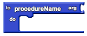
Collects a sequence of blocks together into a group. You can then use the sequence of blocks repeatedly by calling the procedure. If the procedure has arguments, you specify the arguments by using  name  blocks. When you create a procedure, App Inventor automatically generates a  call  block and places it in the  My Definitions  drawer. You use the  call  block to invoke the procedure.
When you create a new procedure block, App Inventor chooses a unique name automatically. You can click on the name and type to change it. Procedure names in an app must be unique. App Inventor will not let you define two procedures in the same app with the same name. You can rename a procedure at any time while you are building the app, by changing the label in the block. App Inventor will automatically rename the associated  call  blocks to match.

procedureWithResult
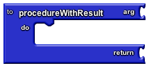
Same as a procedure block, but calling the procedure returns a result. After the procedure executes, the result is returned to the block connected to the return socket.

name
Creates a named argument you can use when calling a procedure. You specify the argument by placing the  name  block into the procedure definition's  arg  socket. You can specify as many arguments as you like: each time you fill in an  arg  socket, another one will be created to accommodate the next argument. To name the argument, you click on the "name" label and type to change it.
When you specify procedure arguments, App Inventor will associate these with the  call  block generated for the procedure: the argument slots for the  call  block will show the argument names you specified.
For each  name  block you define, App Inventor creates an associated  value  block and places it in the  My Definitions  drawer. You use this block to refer to the value of the argument that is passed to the procedure when the procedure is called.
 Note:  In the current version of App Inventor, argument names in an app must be unique, even across procedures. For example you can't have two name procedures each with a variable named "x". When you try to create the second "x" block, App Inventor will not accept that name. This restriction will be relaxed in the future.
variable
Creates a value that can be changed while an app is running, and gives that value a name. Variables are global in scope, which means you can refer to them from any code in the app, including from within procedures.
When you create a new variable block, App Inventor chooses a unique name automatically. You can click on the name and type to change it. Variable names in an app must be unique. App Inventor will not let you define two variables in the same app with the same name.
When you create a variable, App Inventor will automatically create two associated blocks, and place them in the  My Definitions  drawer:
- The global block gets the value of the variable.
- The set global block changes the value of the variable.
You can rename a variable at any time while you are building the app, and the associated blocks will be renamed automatically.
|

This block provides a "dummy socket" for fitting a block that has a plug on its left into a place where there is no socket, such as one of the sequence of blocks in the do part of a procedure or an if block. The block you fit in will be run, but its returned result will be ignored. This can be useful if you define a procedure that returns a result, but want to call it in a context that does not accept a result.

Text Blocks
- [#text text ]
- [#equals = ]
- [#join join ]
- [#maketext make text ]
- [#length length ]
- [#text%3C text< ]
- [#text= text= ]
- [#text%3E text> ]
- [#trim trim ]
- [#upcase upcase ]
- [#downcase downcase ]
- [#startsat starts at ]
- [#contains contains ]
- [#splitatfirst split at first ]
- [#splitatfirstofany split at first of any ]
- [#split split ]
- [#splitatany split at any ]
- [#splitatspaces split at spaces ]
- [#segment segment ]
- [#replaceall replace all ]
text

Contains a text string.
equals

Tests whether two given values are equal. If so, returns true; otherwise, returns false. This is the same block found in the logic drawer and is repeated here for convenience. The arguments can be anything, not just text.
join

Appends the second given string to the first. For this operation, and all text operations, numbers can be treated as text. For example, using a join block to join 1 plus 1 and 2 times 3 results in 26 (2 joined with 6).
make text
Joins all given values into one text string.
length
Returns the length of the given string.
text<
Reports whether the first text string argument is alphabetically less than the second text string. If two strings begin with the same characters, the shorter string is considered smaller. Uppercase characters precede lowercase characters.
text=
Reports whether the text strings are identical, i.e., have the same characters in the same order.
Note that if you are comparing text boxes that contain digits, there is a difference between comparing them numerically using ordinary equality (  =  ) versus comparing them as text strings (  text=  ). If you create two text boxes, one with the characters  123  and one with the characters  0123  , then these will be equal numerically but not equal as text strings. Be careful that, when it comes to comparisons like this, there is a difference between entering the digits using number boxes, versus entering them as text boxes. Suppose you create two number boxes, on with  123  and one with  0123  . If you compare those two boxes using  text=  you'll get the result that they are equal. The reason is that the digits you enter into a number box get converted to a number; the actual string of digits is not preserved. If you want to take account of the actual string of digits, then use a text box.
text>
Reports whether the first text string argument is alphabetically greater than the second text string. If two strings begin with the same characters, the shorter string is considered smaller. Uppercase characters precede lowercase characters.
upcase
Returns a copy of its text string argument converted to uppercase.
downcase
Returns a copy of its text string argument converted to lowercase.
trim
Returns a copy of its text string argument with any leading or trailing spaces removed.
starts at
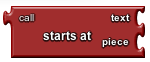
Returns the character position where the first character of piece first appears in text , or 0 if not present. For example, the location of ana in havana banana is 4.

contains
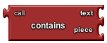
Returns true if piece appears in text ; otherwise, returns false.

split at first
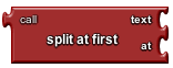
Divides the given text into two pieces using the location of the first occurrence of at as the dividing point, and returns a two-item list consisting of the piece before the dividing point and the piece after the dividing point. Splitting apple,banana,cherry,dogfood with a comma as the splitting point returns a list of two items: the first is the text apple and the second is the text banana,cherry,dogfood . Notice that the comma after apple doesn't appear in the result, because that is the dividing point.

split at first of any
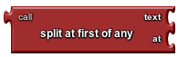
Divides the given text into a two-item list, using the location of any item in the list at as the dividing point.

split
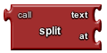
Divides text into pieces using at as the dividing points and produces a list of the results. Splitting one,two,three,four at , (comma) returns the list (one two three four) . Splitting one-potato,two-potato,three-potato,four at -potato, returns the list (one two three four) .

split at any
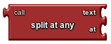
Divides the given text into a list, using any of the items in at as the dividing point, and returns a list of the results. Splitting appleberry,banana,cherry,dogfood with at as the two-element list whose first item is a comma and whose second item is rry returns a list of four items: (applebe banana che dogfood)

split at spaces
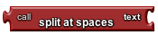
Divides the given text at any occurrence of a space, producing a list of the pieces.
segment
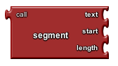
Extracts part of the text starting at start position and continuing for length characters.

replace all
Returns a new text string obtained by replacing all occurrences of the substring with the replacement.
Convertido de HTML para wiki com http://toolserver.org/~diberri/cgi-bin/html2wiki/index.cgi ->  falta trocar  <code>, </syntaxhighlight> por <tt>, </tt>
List Blocks
make a list
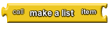
Creates a list from the given blocks. If you don't supply any arguments, this creates an empty list, which you can add elements to later.
select list item
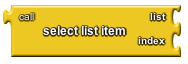
Selects the item at the given index in the given list. The first list item is at index 1.

replace list item
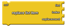
Inserts replacement into the given list at position index . The previous item at that position is removed.

remove list item
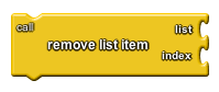
Removes the item at the specified position from the list.

insert list item
Inserts an item into a list at the specified position.
length of list

Returns the number of items in the list.
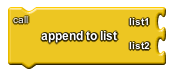
append to list
Adds the items in the second list to the end of the first list

add items to list
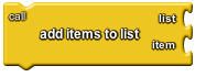
Adds the given items to the end of the list. The difference between this and append to list is that append to list takes the items to be appended as a single list, while add items to list takes the items as individual arguments.

is in list?
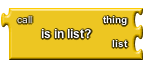
If thing is one of the elements of the list , returns true; otherwise, returns false. Note that if a list contains sublists, the members of the sublists are not themselves members of the list. For example, the members of the list (1 2 (3 4)) are 1, 2, and the list (3 4); 3 and 4 are not themselves members of the list.

position in list
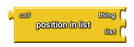
Returns the position of thing in the list, or 0 if it's not in the list.

pick random item
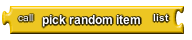
Picks an item at random from the list.
is list empty?

If list has no items, returns true; otherwise, returns false.
copy list
Makes a copy of a list, including copying all sublists.
is a list

If thing is a list, returns true; otherwise, returns false.
list to csv row
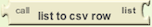
Interprets the list as a row of a table and returns a CSV (comma-separated value) text representing the row. Each item in the row list is considered to be a field, and is quoted with double-quotes in the resulting CSV text. Items are separated by commas. The returned row text does not have a line separator at the end.
list to csv table
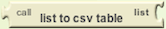
Interprets the list as a table in row-major format and returns a CSV (comma-separated value) text representing the table. Each item in the list should itself be a list representing a row of the CSV table. Each item in the row list is considered to be a field, and is quoted with double-quotes in the resulting CSV text. In the returned text, items in rows are separated by commas and rows are separated by CRLF (\r\n).
list from csv row
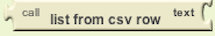
Parses a text as a CSV (comma-separated value) formatted row to produce a list of fields. It is an error for the row text to contain unescaped newlines inside fields (effectively, multiple lines). It is okay for the row text to end in a single newline or CRLF
list from csv table
Parses a text as a CSV (comma-separated value) formatted table to produce a list of rows, each of which is a list of fields. Rows can be separated by newlines (\n) or CRLF (\r\n).